 Greetings friends, today I bring you a new entry about Grafana. First of all, sorry for the drought, but it has been a very intense 2022, with many projects that have been taking me more time than I would like.
Let’s get back to the good stuff, the meat of the matter. I was reviewing the new features of Grafana 9, which there are many and I will tell you in more detail in another post, but I see with surprise that in the latest update, 9.2, already include a new Canvas panel.
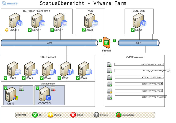
For all of you who like to add metrics on top of your maps, you will surely remember the ancient NagVis:
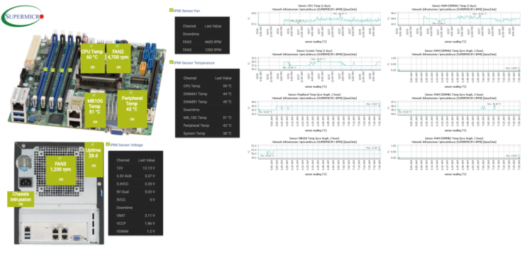
 And some others, using PRTG, will surely remember the fantastic maps I left you with for monitoring our Supermicros, or NAS:
Canvas Support in Grafana v9.2+
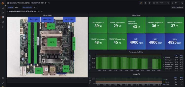
All well and good, but I know already that you have been using Grafana for a long time now, probably to monitor your Veeams, and your VMwares. And for all that, it was about time we could add our panels to Grafana, at the end of this tutorial you will have something similar to the following:
This new panel that combines the power of Grafana with the flexibility of custom elements such as images and icons. Canvas visualizations are extensible panels built with forms that allow us to explicitly place elements within static and dynamic layouts. This will allow us to design custom visualizations and overlay data in ways that are not possible with standard Grafana panels, all within the Grafana UI. If you have used any of the aforementioned tools, NagVis, PRTG, or similar, the Canvas panel design will be very familiar to you.
Find all the official information here.
Step by step to get a Canvas like the one I show you – Temperature and Status of a Supermicro A+ Server 5019D-FTN4
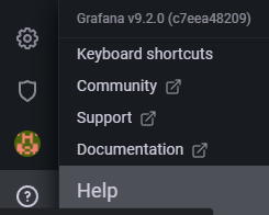
I know that many times it’s nice to make you feel like you’re getting your teeth into beautiful dashboards, but you know that I always give you everything step by step, or even the dashboards ready to go. The first thing we have to make sure is that we are running Grafana v9.2 or higher:
 Once we have the version we need, we will be able to reuse our panels that already have information, for example, I have used my panel with the temperatures that come by IPMI from my Supermicro, and I have changed the panel from Stat type, to Canvas type:
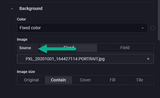
 The next thing will be to upload the image we want, attention! we can use an image with public URL, like me in my case:
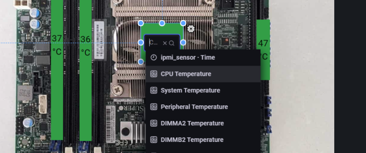
 Once we have the nice image we want, we will start adding elements to the layer, there are several types including static text, icons, and of course values from our metrics, in my case I select one of my queries:
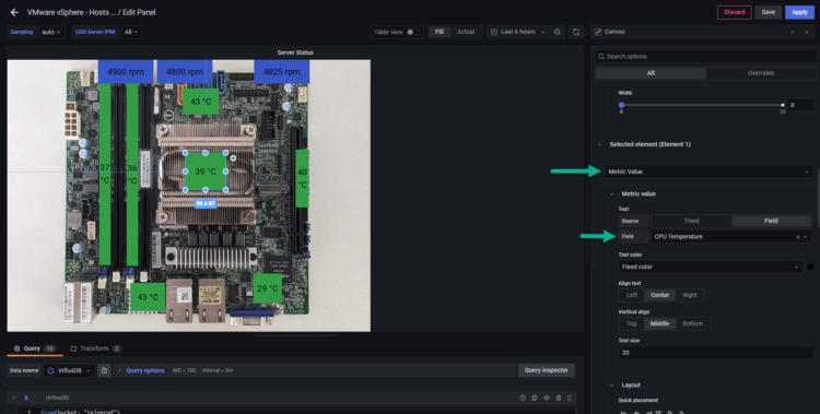
 If we would like to see a little more the parameters of each element, we can see it on the right by scrolling:
 And well, that’s it! We put as many values as we want, from as many queries as we need. If we want something more elegant we can always use .gif to make it more dynamic.
Tips and advanced configurations
There are some more advanced steps to get to see the value we want, I’m going to open the melon of wisdom, I hope it helps.
InfluxDB Flux Query
Here is the exact query I make to read IPMI data that telegraf stores natively:
from(bucket: "telegraf")
  |> range(start: v.timeRangeStart, stop: v.timeRangeStop)
  |> filter(fn: (r) => r["_measurement"] == "ipmi_sensor")
  |> filter(fn: (r) => r["server"] == "192.168.1.61")
  |> filter(fn: (r) => r["name"] == "cpu_temp")
  |> filter(fn: (r) => r["_field"] == "value")
  |> aggregateWindow(every: v.windowPeriod, fn: mean, createEmpty: false)
  |> yield(name: "mean")
Convert the ugly output of InfluxDB to something more human-like
Each Grafana query comes with all the tags, values and so on. Maybe not if we make it more complex, but by default it is very long and not very easy to use. I have used the Transformations field, next to the queries, and I have used two optimizations, the first one “Concatenate fields”, and the second one “Organize fields”, as you can see:
This way, when we are in the Canvas drop-down, we will be able to see something that anyone can read: CPU Temperature, System Temperature, etc.
Overrides, edit some parameters on the fly
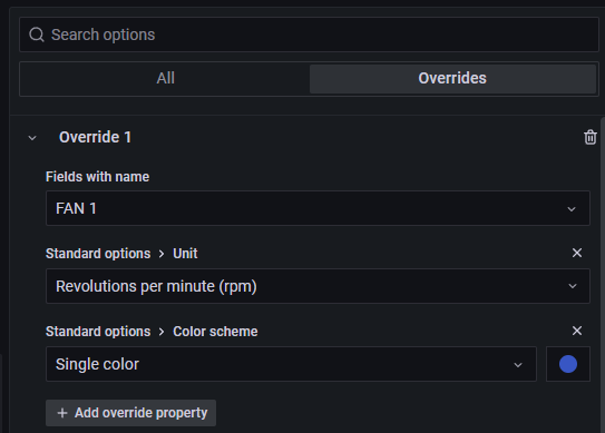
In my case, I want to show some results that are not only degrees Celsius, let’s imagine the speed of the fans, I have added an override for each fan, and as you can see I have said that the value is of type rpm, and blue color (remembering the wind, and the airflow).
Conclusions and much more
Canvas is really something I have been waiting for many years, there were some third party plugins that did something similar, but it is always much better to have support, and documentation from the manufacturer. As a long time user of NagVis maps, or PRTG, I think this step, besides including it in the open source version, is a great step for everyone.
That’s all folks, if you want to follow the full Blog series about Grafana, InfluxDB, Telegraf, please click on the next links:
I hope you like it, and I would like to leave you the complete series here, so you can start playing with the plugins that I have been telling you about all these years:
- Looking for the Perfect Dashboard: InfluxDB, Telegraf, and Grafana – Part I (Installing InfluxDB, Telegraf, and Grafana on Ubuntu 20.04 LTS)
- En busca del Dashboard perfecto: InfluxDB, Telegraf y Grafana – Parte II (Instalar agente Telegraf en Nodos remotos Linux)
- En busca del Dashboard perfecto: InfluxDB, Telegraf y Grafana – Parte III Integración con PRTG
- En busca del Dashboard perfecto: InfluxDB, Telegraf y Grafana – Parte IV (Instalar agente Telegraf en Nodos remotos Windows)
- En busca del Dashboard perfecto: InfluxDB, Telegraf y Grafana – Parte V (Activar inputs específicos, Red, MySQL/MariaDB, Nginx)
- En busca del Dashboard perfecto: InfluxDB, Telegraf y Grafana – Parte VI (Monitorizando Veeam)
- En busca del Dashboard perfecto: InfluxDB, Telegraf y Grafana – Parte VII (Monitorizar vSphere)
- En busca del Dashboard perfecto: InfluxDB, Telegraf y Grafana – Parte VIII (Monitorizando Veeam con Enterprise Manager)
- En busca del Dashboard perfecto: InfluxDB, Telegraf y Grafana – Parte IX (Monitorizando Zimbra Collaboration)
- En busca del Dashboard perfecto: InfluxDB, Telegraf y Grafana – Parte X (Grafana Plugins)
- En busca del Dashboard perfecto: InfluxDB, Telegraf y Grafana – Parte XI – (Monitorizando URL e IPS con Telegraf y Ping)
- Looking for the Perfect Dashboard: InfluxDB, Telegraf, and Grafana – Part XII (Native Telegraf Plugin for vSphere)
- Looking for the Perfect Dashboard: InfluxDB, Telegraf, and Grafana – Part XIII (Veeam Backup for Microsoft Office 365 v4)
- Looking for the Perfect Dashboard: InfluxDB, Telegraf, and Grafana – Part XIV – Veeam Availability Console
- Looking for the Perfect Dashboard: InfluxDB, Telegraf, and Grafana – Part XV (IPMI Monitoring of our ESXi Hosts)
- Looking for Perfect Dashboard: InfluxDB, Telegraf, and Grafana – Part XVI (Performance and Advanced Security of Veeam Backup for Microsoft Office 365)
- Looking for the Perfect Dashboard: InfluxDB, Telegraf, and Grafana – Part XVII (Showing Dashboards on Two Monitors Using Raspberry Pi 4)
- En busca del Dashboard perfecto: InfluxDB, Telegraf y Grafana – Parte XVIII – Monitorizar temperatura y estado de Raspberry Pi 4
- Looking for the Perfect Dashboard: InfluxDB, Telegraf, and Grafana – Part XIX (Monitoring Veeam with Enterprise Manager) Shell Script
- Looking for the Perfect Dashboard: InfluxDB, Telegraf, and Grafana – Part XXIV (Monitoring Veeam Backup for Microsoft Azure)
- Looking for the Perfect Dashboard: InfluxDB, Telegraf, and Grafana – Part XXV (Monitoring Power Consumption)
- Looking for the Perfect Dashboard: InfluxDB, Telegraf, and Grafana – Part XXVI (Monitoring Veeam Backup for Nutanix)
- Looking for the Perfect Dashboard: InfluxDB, Telegraf, and Grafana – Part XXVII (Monitoring ReFS and XFS (block-cloning and reflink)
- Looking for the Perfect Dashboard: InfluxDB, Telegraf, and Grafana – Part XXVIII (Monitoring HPE StoreOnce)
- Looking for the Perfect Dashboard: InfluxDB, Telegraf, and Grafana – Part XXIX (Monitoring Pi-hole)
- Looking for the Perfect Dashboard: InfluxDB, Telegraf, and Grafana – Part XXIX (Monitoring Veeam Backup for AWS)
- Looking for the Perfect Dashboard: InfluxDB, Telegraf, and Grafana – Part XXXI (Monitoring Unifi Protect)
- Looking for the Perfect Dashboard: InfluxDB, Telegraf, and Grafana – Part XXXII (Monitoring Veeam ONE – experimental)
- Looking for the Perfect Dashboard: InfluxDB, Telegraf, and Grafana – Part XXXIII (Monitoring NetApp ONTAP)
- Looking for the Perfect Dashboard: InfluxDB, Telegraf, and Grafana – Part XXXIV (Monitoring Runecast)
- Looking for the Perfect Dashboard: InfluxDB, Telegraf, and Grafana – Part XXXV (GPU Monitoring)
- Looking for the Perfect Dashboard: InfluxDB, Telegraf, and Grafana – Part XXXVI (Monitoring Goldshell Miners – JSONv2)
- Looking for the Perfect Dashboard: InfluxDB, Telegraf, and Grafana – Part XXXVII (Monitoring Veeam Backup for Google Cloud Platform)
- En Busca del Dashboard perfecto: InfluxDB, Telegraf y Grafana – Parte XXXVIII (Monitorizando Temperatura y Humedad con Xiaomi Mijia)
- Looking for the Perfect Dashboard: InfluxDB, Telegraf, and Grafana – Part XXXIX (Veeam Restore Portal Users Login Audit)
- Looking for the Perfect Dashboard: InfluxDB, Telegraf, and Grafana – Part XL (Veeam Backup for Microsoft 365 – Restore Audit)


Leave a Reply